Design Areas: Editorial Design, Typography, Visual Design
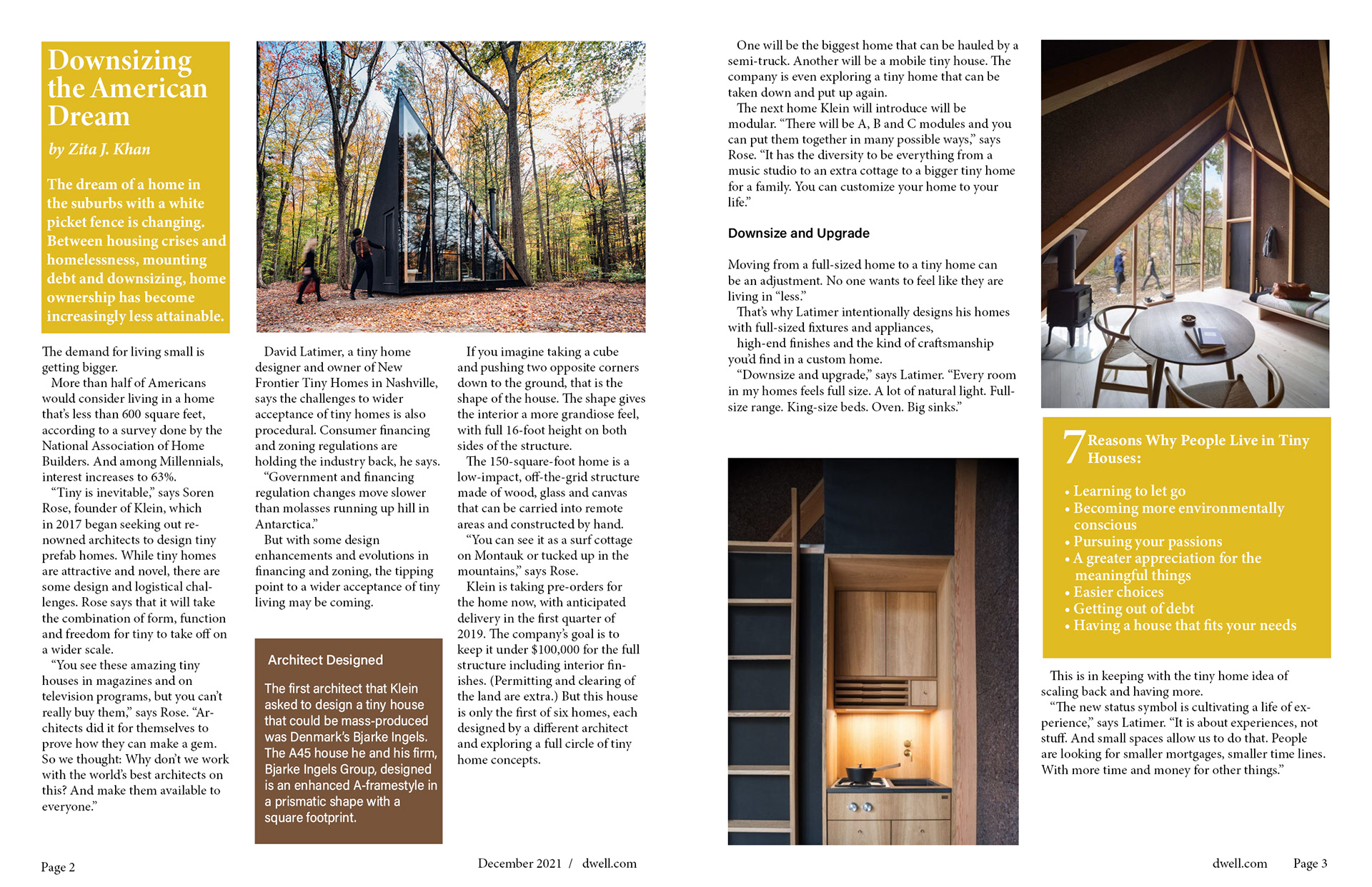
Magazine Cover With 2-Page Spread
Design Challenge: Create a magazine spread with a cover page of any existing magazine of your choice (text provided). Recreate their logo in Illustrator, add extra elements to the cover page using Photoshop, and design the spread in InDesign. In addition, use the right typography with design principles to stay true to the original magazine's feel and look, also to keep your readers engaged.
Design Process: I traced and redrawn "dwell" in Illustrator, added my dog's picture to the cover page with Photoshop, and created the spread in InDesign. I chose exciting imagery that harmonizes in style and color, a color theme matching the pictures, and fonts that are not just pleasant to the eye but also easy to read.
Design Area: Editorial Design, Typography

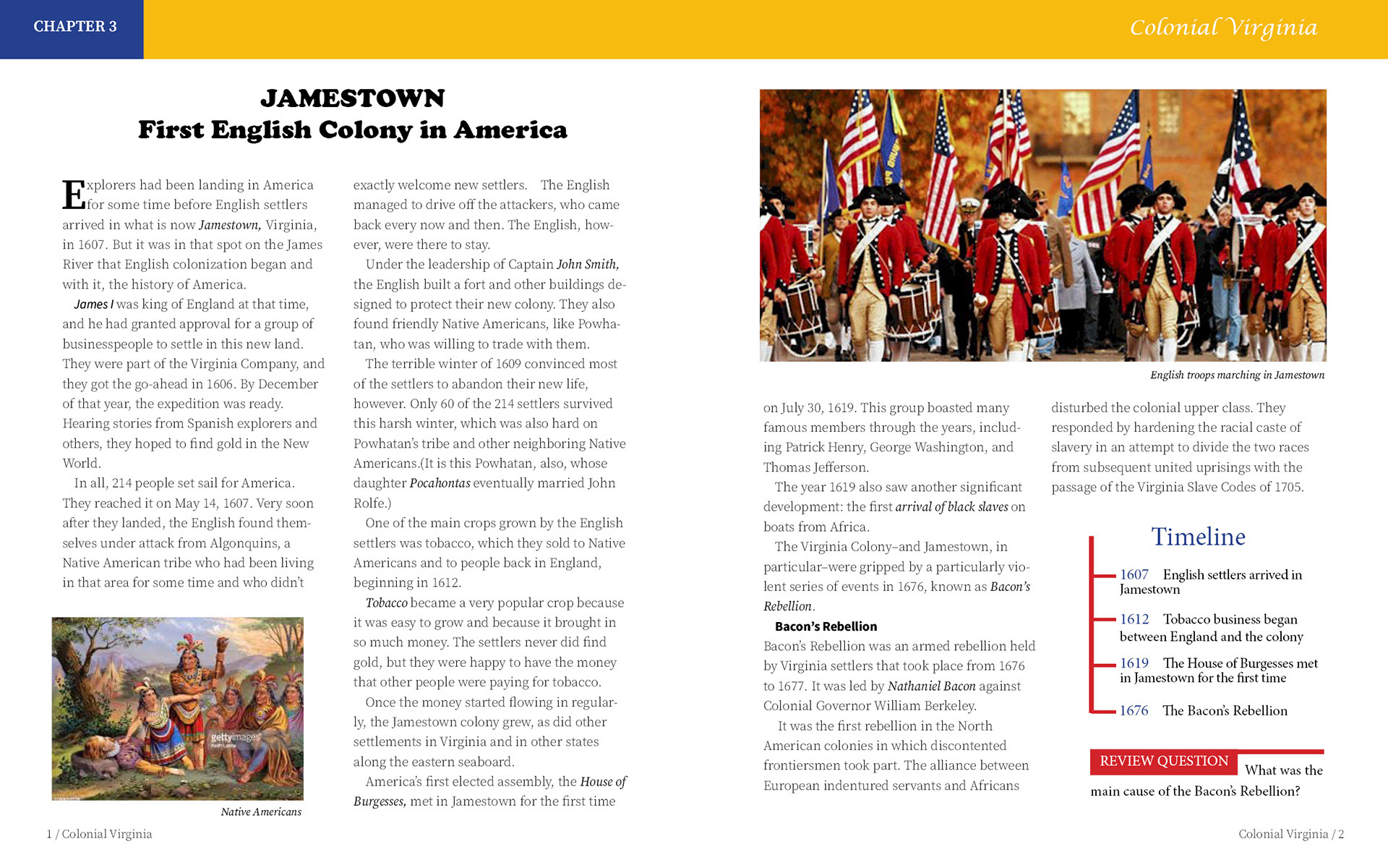
Chapter Book Spread
Design Challenge: Create a textbook spread in InDesign for an age group of your choice. Mindfully apply the proper typographic rules and design principles (typeface, layout, colors, illustration, etc.) accordingly to your target audience.
Design Process: I designed a social study textbook spread for middle-school-age students. I used colorful images and layout design for visual interest, a moderate amount of text with highlighted words, as well as a chapter summary for better reading comprehension. I also chose a serif font with a larger leading (space between lines) to promote optimal reading speed and a pleasant reading experience.
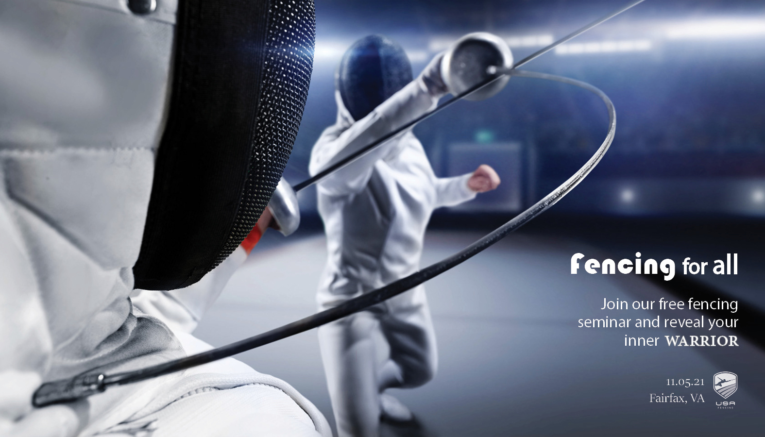
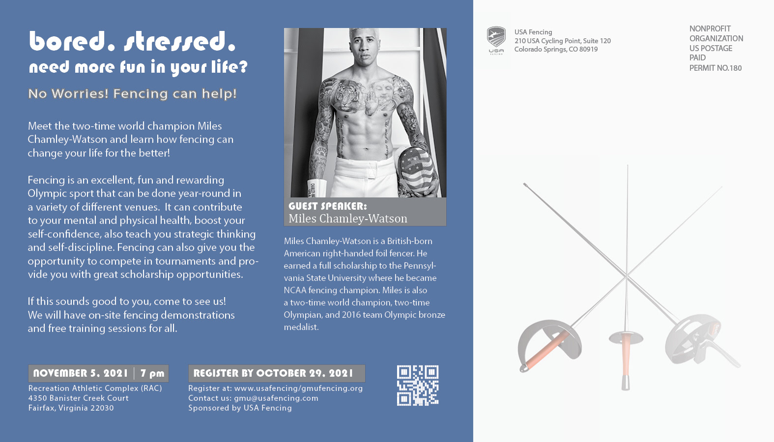
Oversized Postcard
Design Challenge: Create an oversized, double-sided postcard for an event of your choice. Include a "call to action" on the front of the card with related imagery or illustration to your topic. Add a guest speaker with a short bio and event description. Include the company logo, address, and nonprofit postage stamp on the back of the card.
Design Process: I designed my postcard to promote fencing among college students. I choose engaging imagery with cool but energizing colors to grab attention and to represent fencing's positive mental and physical benefits. For the title text, I used curvy sans-serif font to match the blade's movement and touch on fencing's modern and dynamic aspects. For the body text, I selected a modern sans-serif font for easy readability. I choose a young and hip fencing champion as a spokesperson to whom the college students could easily relate. Finally, the message was wrapped in a relaxed, easy-going language to appeal to my target audience.
Editorial Spread
Design Challenge: Create any editorial spread to demonstrate visual harmony with text and image integration.
Design Process: I designed my spread about the snowdrop, a beautiful flower with many spiritual and symbolic meanings. I aimed to highlight its exceptional beauty as the primary focus. Therefore, I adopted an image-dominant approach to draw the audience's attention. To achieve visual harmony between the text and the image, I chose a curly sans-serif font that reflects the snowdrop's elegant nature. Additionally, I applied text wrap, shaping the words around the contours of the flower, enhancing the overall visual appeal of the spread.

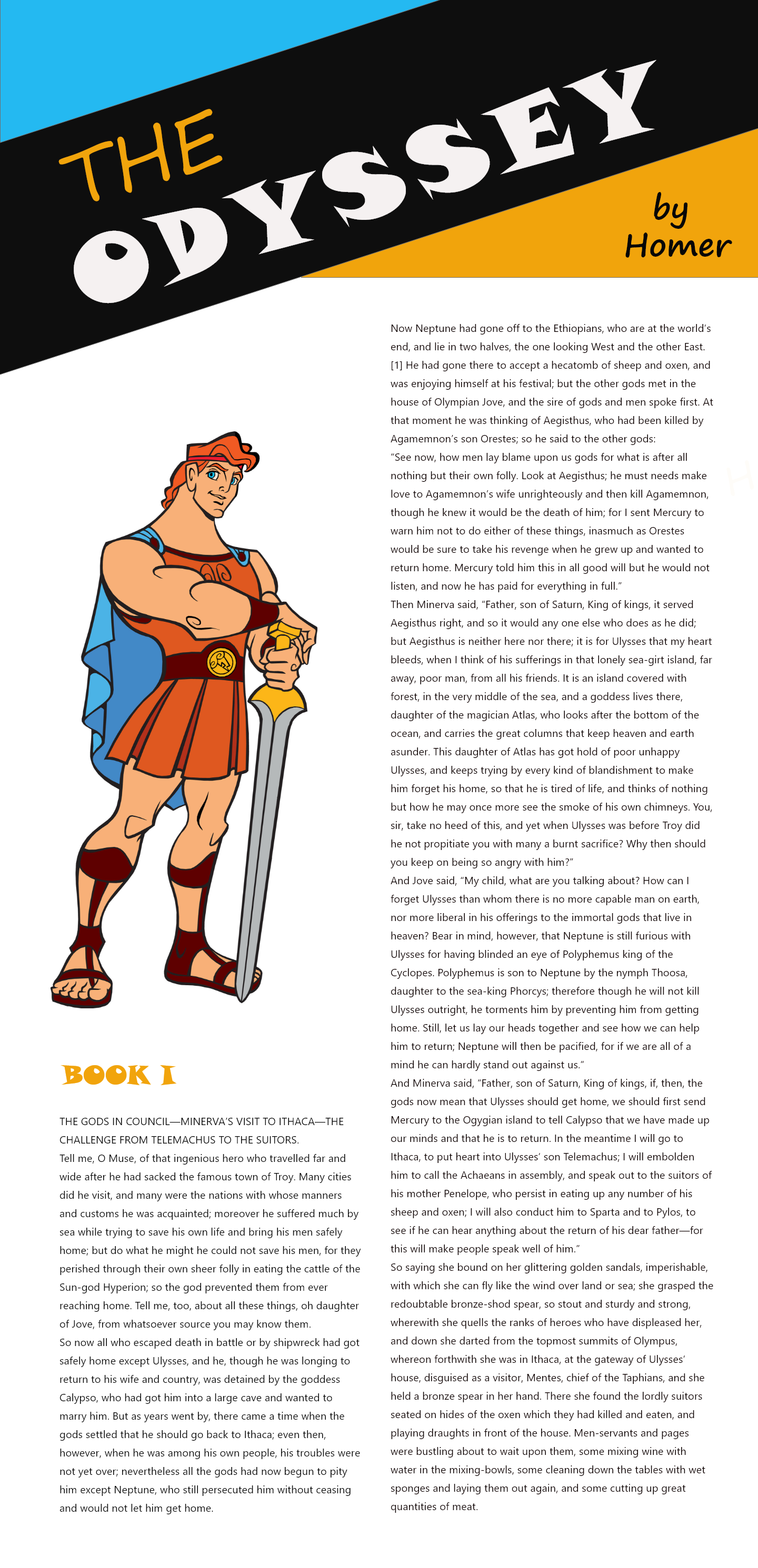
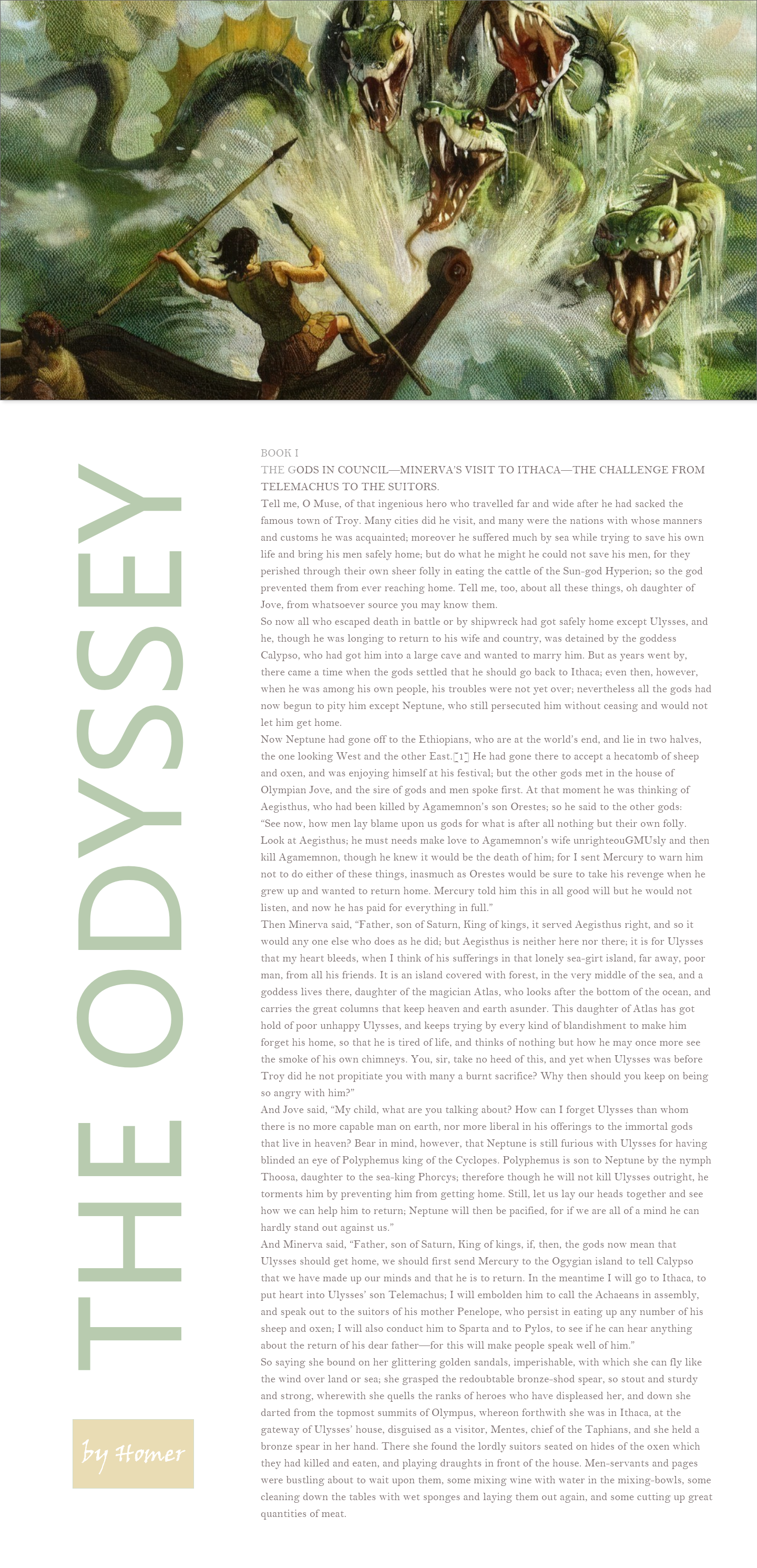
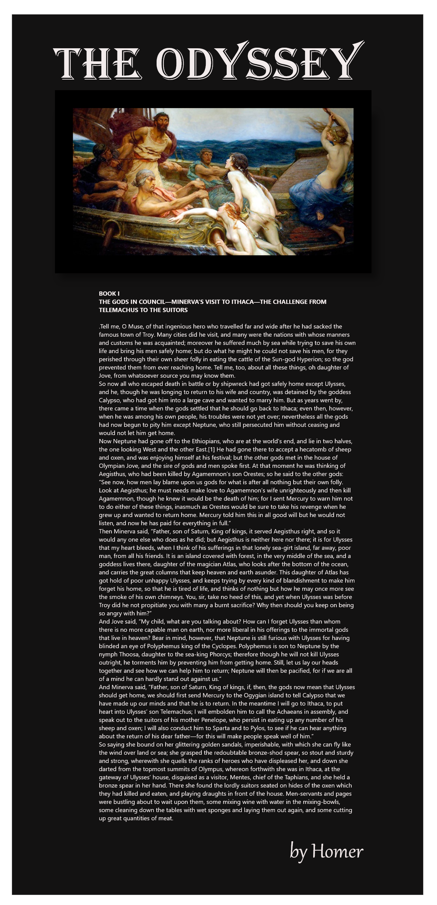
Adaptive Learning Design
Design Challenge: Create 3 different illustrations for 3 different audiences with the same content in Adobe XD.
Design Process: I chose Odyssey's Book 1 by Homer for my illustrations. The first illustration has a contemporary style that targets young adults to middle-aged readers. I used sans-serif types and attention-grabbing imagery to create a modern, contemporary style.
Design Areas: Instructional Design, Typography, Visual Design
My second illustration is designed with an older audience in mind. I used types with a more conservative style combined with darker colors and classical imagery.
My third illustration has colorful, comic-style typography with a cartoon character for a younger audience.